
[Audioguide]
Enrique Ferrer Vieyra, a renowned scholar and alumnus, donated this collection to Biblioteca Mayor UNC (First library of our University) in 2001.
It takes us on a journey through the changes and innovations in the design of books, such as addition of title pages, introduction of pagination, reduction in size and standardisation of typefaces.
5 – A. Antiphonary
[Audioguide]
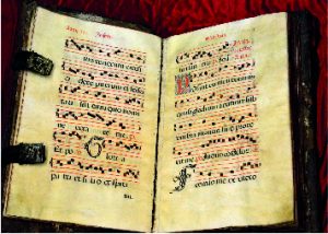
An Antiphonary is a liturgical book containing the text the members of a choir read during catholic liturgy. The name antiphonary comes from a Greek word and it translates as “the opposite voice” (response).
It contains the antiphons, short sentences from the Holy Scripture which are sung or recited before or after a psalm or canticle, as a refrain. The size of this book is fairly large so all the members of a choir can easily read it. We may find a reference to this kind of music in Gregorian chants, where they are used widely.
This Antiphonary was produced in the early 17th Century in the Monastery of Santa María Real de Nájera, in today’s Comunidad Autónoma de La Rioja, Spain. It contains the Feasts between June 24th to August , as read in the front page.
5 – B. Incunabula
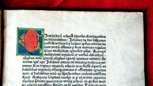
This collection holds 22 incunabula.
The word incunable comes from Latin “incunabulum” meaning the book in its cradle. It refers to books that were printed during the earliest period of typography (1440-1501) with metal types.
– Characteristics of an incunable
– Printed in the same style as manuscripts.
– Typefaces are diverse according to region and genre: Gothic types prevailed in religious, law and literary works , while Roman types were used for humanist and classical authors.
– Use of contractions and abbreviations in sentences.
– Use of pilcrow, a typographical character or colour sign to mark the start of a paragraph or train of thought.
– Use of a square dot star or asterisk to symbolise a full stop.
– Use of rubrication at the beginning of the chapter, that is the first letter was in large size and red ink. During the process of printing, a blank square was left on the corresponding part of the page for a craftsman to draw the decorative initial. Many times they were unfinished leaving the guide letter (a small form of the letter to be drawn) visible.
– Until 1480’s texts begins immediately after the title with the word incipit (here begins)
– At the end of the book there is a section called colophon (finishing stroke) describing the printer, date and place of printing, resembling manuscripts’ “Explicit liber qui dicitur…”(from the book that says). Sometimes it takes the form of an inverted pyramid or adds the printer’s mark, a design that represents the printer.
5 – C. Elzevir
[Audioguide]
This collection holds 50 elzevir books.
The Elzevir family was in the book business between 1587 and 1681. They founded their first Printing House in Leiden (Holland) and expanded later to Amsterdam and Utrecht. Their influence extended through Europe due to the incorporation of new techniques and the selection of works they decided to print.
The works issued from the press of the Elzevirs include works in theology, philosophy and politics, law and medicine, French theatre and literature, and a series of famous dictionaries. They reprinted the works of authors such as Virgil, Seneca, Pliny, Julius Caesar, Cicero (often with notes by renowned scholars of the time) with such sales success, that the Elzevir could afford to print contemporary authors like Erasmus, Descartes, Galileo or Grotius.
They were even able to print controversial publications like the philosophical works by Thomas Hobbes.
The Elzevir family expanded the book market by producing neat, attractive and inexpensive books. They are known for their small format, the elegant typefaces and beautiful front pages.